Starlight mapping children's needs
Reference article: DataKind UK - Starlight
More about what Starlight is doing: Starlight
Problem Statement
Starlight Children's Foundation needed to understand where there is overlap between their services, hospital play provision, and donors to make strategic decisions about service provision and fundraising efforts.
Key objectives:
- Map the distribution of Starlight services across the UK
- Identify gaps in play provision and service coverage
- Analyze disparities between different ethnicities and demographics
- Optimize resource allocation based on demonstrated need
Research Questions:
- Where are the gaps between Starlight's services and areas of greatest need?
- How does play provision vary across different regions and demographics?
- What factors influence the distribution of hospital play services?
- How can Starlight be more strategic in directing resources to areas with the greatest need?
Dataset Involved
Primary Data Collection: Much of the data had to be collected through freedom of information (FOI) requests from 140 hospital trusts and health boards across the UK.
Data Types Collected:
- Number of child admissions by hospital
- Level of play provision and specialist staff
- Play budgets and resource allocation
- Geographic location of services
Response Rate: 87% of trusts responded, with some gaps in the data for those that did respond, suggesting that potentially useful data is not being systematically collected.
Geospatial Processing: Geographic data was processed and standardized to enable efficient map visualizations and spatial analysis.
Desired Output
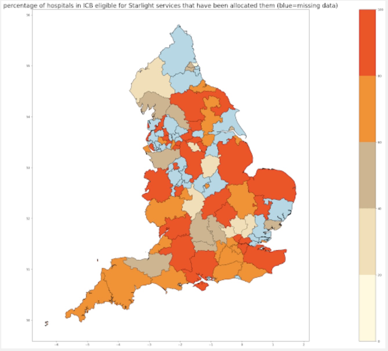 Figure 1: Starlight heat map showing distribution of signed-up centres across the UK
Key Findings:
- Even Resource Distribution: Starlight's resources were spread evenly over deprived and less deprived areas, indicating potential for more targeted allocation
- Service Gaps Identified: Some regions had more eligible trusts than were receiving play provisions
- Admission vs. Service Mismatch: Other regions had significantly more hospital admissions than boxes distributed
- Strategic Opportunity: Clear evidence that Starlight could be more strategic about directing help to places with the greatest need
Replicating the Output with KindTech
Data Requirements
Synthetic Data Generation: Create realistic datasets representing:
- Play provision levels across clinical commissioning groups (CCGs)
- Hospital admission rates for children
- Geographic distribution of Starlight services
- Demographic and deprivation indicators
Geographic Boundaries: Clinical commissioning group (CCG) boundaries for spatial analysis and mapping
Analysis Workflow
- Data Generation: Create synthetic play provision data across clinical regions
- Geographic Mapping: Map data to relevant CCG boundaries for visualization
- Gap Analysis: Identify areas with high need but low service provision
- Visualization: Create heat maps showing service distribution and need indicators
Reproduction
A runnable, end-to-end reproduction lives in
examples/starlight_play_provision.py
(a marimo notebook). It maps synthetic provision against
need over England's real NHS commissioning geography:
 — run it live in the browser (the molab cloud runtime fetches real ONS
data), or locally with
— run it live in the browser (the molab cloud runtime fetches real ONS
data), or locally with uv run marimo edit examples/starlight_play_provision.py.
from kindtech import load_geodata, geodata_to_properties
import pandas as pd

# England's 42 Integrated Care Boards (the geography that replaced CCGs)
geojson = load_geodata(geography_type="ICB", year="2023", coverage="EN", boundary_type="BSC")
icbs = pd.DataFrame(geodata_to_properties(geojson, "ICB", 2023))
ICBs, not CCGs
Clinical Commissioning Groups were abolished in July 2022 and replaced by Integrated Care Boards. KindTech serves the current ICB boundaries, so the reproduction uses the 42 ICBs as the commissioning unit; the workflow is identical to the original CCG analysis.
The original study's admission and provision figures came from FOI returns that
aren't public, so the notebook generates a deterministic stand-in (rng(3))
where child admissions vary widely (the need) but boxes are distributed
roughly evenly (the resource) — the exact pattern the study flagged.
Need vs provision — child admissions (left) and boxes distributed (right). The two maps don't share their dark areas, which is the point:
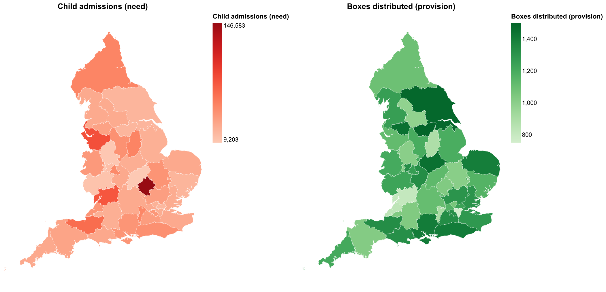 Figure 2: Child admissions (left, the need) vs Starlight boxes distributed
(right, the resource) across England's 42 ICBs. Provision does not follow need.
Figure 2: Child admissions (left, the need) vs Starlight boxes distributed
(right, the resource) across England's 42 ICBs. Provision does not follow need.
Does provision follow need? Each ICB's admissions against its boxes:
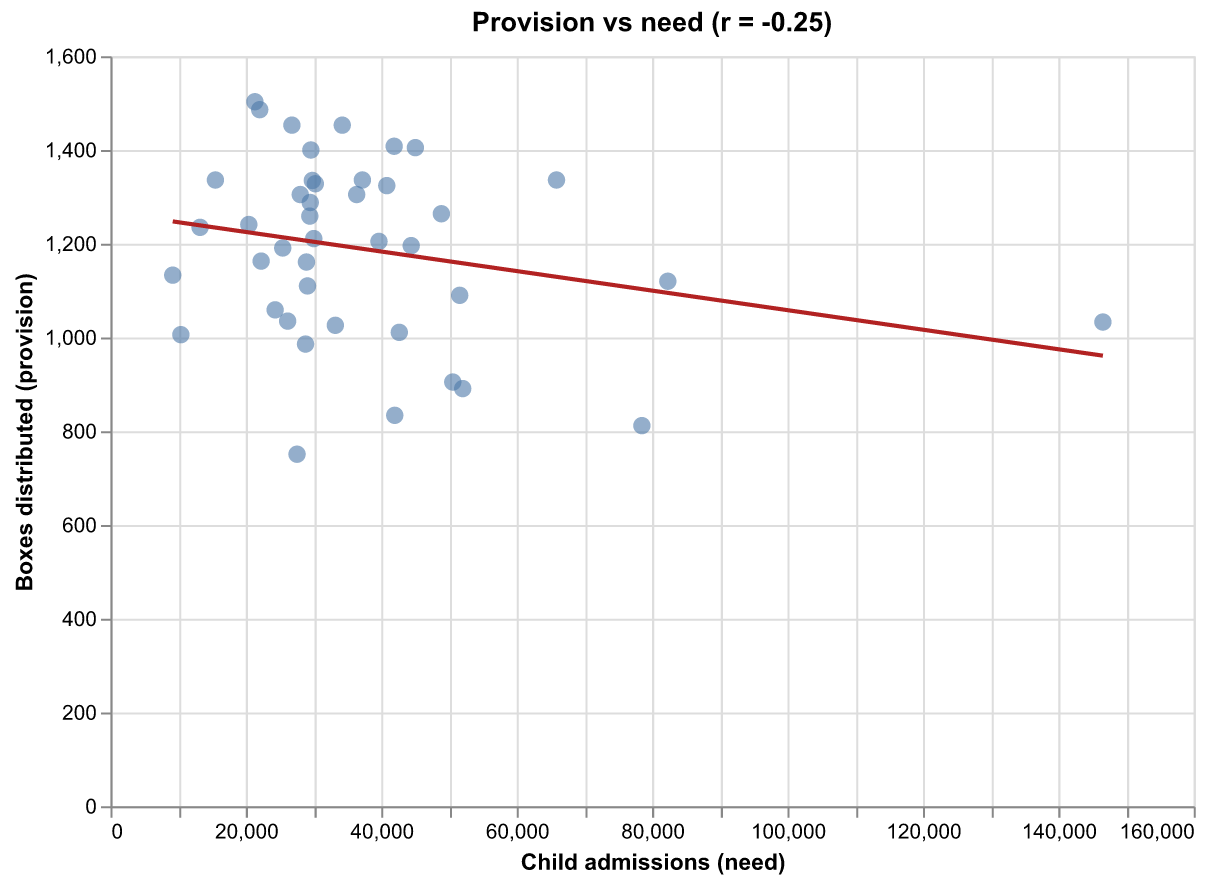 Figure 3: A near-flat (slightly negative) relationship between need and
provision — resources are spread evenly regardless of demand, the
"be more strategic" opportunity the original study identified.
Figure 3: A near-flat (slightly negative) relationship between need and
provision — resources are spread evenly regardless of demand, the
"be more strategic" opportunity the original study identified.
To run on real data, replace the synthetic columns with Starlight's FOI returns keyed by ICB (or by trust, then mapped to ICB); the boundary join, coverage maths and maps are unchanged.
Lessons Learned
Key takeaways and recommendations:
- Map provision against need, not in isolation: plotting boxes alongside admissions on the same geography immediately exposes the decoupling that a provision-only view hides.
- Even distribution is a finding, not a default: a near-flat need-vs-provision relationship is itself the evidence that allocation could be more strategic.
- Coverage ratios rank the opportunity: boxes per 1,000 admissions turns the gap into an ordered list of where redirecting resource helps most.
- Stable geography matters: serving current ICB boundaries (post-CCG) keeps the analysis aligned with how the NHS commissions today, with no manual crosswalk.